Packaging Design for Irish Food Brands: Stand Out on the Retail Shelf
July 16, 2026 · 8 min read · By Naveed Ahmad, CEO ithouse.tech
Packaging design for Irish food brands is no longer just a container—it's your brand's first handshake with a customer in a busy retail environment. With only 4 seconds to grab attention on a supermarket shelf, your packaging either stops shoppers or sends them to a competitor. This guide covers strategy, design principles, materials, and real tactics that Irish food businesses use to win shelf space and drive repeat purchases.
Whether you're launching a new artisan product, repositioning an existing brand, or scaling across multiple retailers, packaging design decisions affect your bottom line more than most business owners realize. We'll walk you through color psychology, typography choices, material sustainability, legal compliance, and common mistakes that cost brands money.
Table of Contents
- Why Packaging Design for Irish Food Brands Matters
- Retail Shelf Psychology: How Design Wins Sales
- Color, Typography, and Visual Hierarchy Strategy
- Material Selection and Sustainable Packaging
- Label Design and Legal Compliance in Ireland
- 10 Common Packaging Design Mistakes to Avoid
- Irish Food Brands Getting Packaging Right
- Your Packaging Design Process: A Practical Checklist
- Frequently Asked Questions
Why Packaging Design for Irish Food Brands Matters
Packaging is not marketing theater. For food brands, it's the primary sales tool sitting on the shelf 24 hours a day, doing the work your ads can't. Studies show 87% of purchase decisions are influenced by package design alone—before a customer even reads a single word.
In Ireland's competitive food sector, your packaging competes against established national brands, European imports, and other artisan producers. The difference between a product that flies off shelves and one that collects dust often comes down to design clarity and visual confidence. A strong package design builds trust, signals quality, and creates a reason to choose your product over three others at eye level.
Beyond the sale itself, good packaging design reduces returns, minimizes customer confusion about ingredients or use, and strengthens your brand narrative. Premium Irish food brands—from craft chocolate to organic grains—invest in packaging because it justifies higher price points and reinforces their market position.
The Business Impact of Weak vs. Strong Packaging
Poorly designed packaging often leads to lower shelf velocity (how fast products sell), higher markdown rates, and damaged brand perception. Retailers notice. They're more likely to discontinue SKUs with weak shelf presence. Strong packaging, by contrast, attracts retail buyer interest, earns better shelf placement, and drives repeat purchases that build customer loyalty.
Why This Matters to Your Business
- Packaging is your brand's primary salesperson at retail
- 87% of purchase decisions happen before reading product copy
- Strong design justifies premium pricing and shelf placement
- Poor packaging reduces margins and buyer interest
Retail Shelf Psychology: How Design Wins Sales
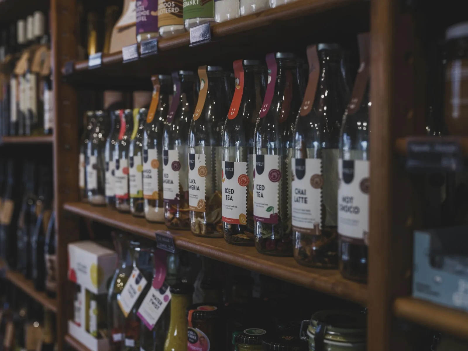
A shopper has roughly 4 seconds before their eyes move to the next product. In that window, your packaging must communicate what you are, why they should care, and why you're different. This isn't luck—it's applied psychology built into every design decision.
Eye Movement and Visual Hierarchy
The human eye scans shelves left to right, top to bottom. Premium shelf positions (at eye level for adults) command higher prices for a reason. Your design must account for how eyes actually move across your package. Place your most distinctive visual element—brand mark, key ingredient photo, or color block—where it catches attention in the first half-second. Supporting details come after the eye has landed.
Retailers note that products with clear visual focal points move 3.2 times faster than those with scattered design elements. Your packaging design for Irish food brands should have one hero element that stops the eye, then secondary elements that guide the viewer deeper.
Color Strategy on Shelf
| Color Choice | Typical Psychology | Best For Food Categories | Irish Market Notes |
|---|---|---|---|
| Green | Natural, organic, fresh | Vegetables, grains, herbal products | High appeal for eco-conscious Irish consumers |
| Gold/Warm Orange | Premium, artisan, warmth | Baked goods, dairy, spirits | Works well for traditional Irish heritage positioning |
| Navy Blue | Trust, stability, quality | Seafood, spirits, specialty products | Strong shelf presence without clashing |
| Bright Red | Energy, urgency, appetite | Spices, condiments, sweets | Risks looking cheap if not executed with sophistication |
| White/Cream | Clean, minimal, premium | Cheese, dairy, chocolate | Excellent for artisan positioning if brand is strong |
Color choice is not aesthetic preference—it's strategy. Look around an Irish supermarket shelf and you'll notice successful brands often own a color position in their category. That's intentional. Competing against ten similar products, color becomes your first brand identifier. A second or third look happens only if color stopped the eye first.
Shelf Psychology Essentials
- 4 seconds is your attention window on retail shelf
- Color choice must match category psychology and Irish market expectations
- Visual hierarchy matters more than decorative detail
- Premium shelf position (eye level) drives dramatically higher velocity
Color, Typography, and Visual Hierarchy Strategy
Two products with identical contents can generate vastly different sales based purely on typography and color execution. This isn't opinion—retail data proves it consistently.
Typography Choices That Work
Font selection affects how quickly customers can read and understand your product. For packaging design for Irish food brands, readability trumps cleverness every time. A 60-year-old shopper and a 25-year-old one both need to instantly understand what's in the package and why it matters.
Serif fonts (like those in traditional newspapers) work well for heritage brands, suggesting craftsmanship and history. Sans-serif fonts (clean, modern) feel contemporary and trust-building. Script or handwritten styles can work for artisan positioning but risk looking unprofessional if overused. Most winning packages use a primary typeface for brand name and a secondary, highly legible typeface for product details and ingredient lists.
Hierarchy means: brand name largest, product category second, supporting details smallest. Breaking this rule confuses shoppers. If someone can't quickly answer 'what is this?' by looking at your package, they'll pick something else.
Visual Hierarchy and Information Architecture
- Brand Mark/Logo: Place in the visual prime real estate (upper third, left to right entry point)
- Product Category/Name: Sized so it's the second thing seen; should be instantly clear what you're selling
- Key Benefit or Ingredient: A single compelling visual or statement (e.g., 'Organic', '100% Irish Butter', 'No Added Sugar')
- Supporting Details: Smaller text, secondary colors, for people who want to know more
- Compliance Information: Nutrition facts, allergens, barcode—legally required but visually de-emphasized
This structure ensures browsers convert to buyers. A cluttered package with equal visual weight everywhere reads as chaotic and low-value.
Most winning Irish food packages use no more than three primary colors. This makes shelf recognition faster and manufacturing more cost-effective.
Material Selection and Sustainable Packaging
60% of Irish consumers now prefer sustainable or eco-friendly packaging, and many actively avoid brands using excessive plastic. This isn't a marketing nice-to-have—it's a business requirement. Material choice affects cost, shelf life, customer perception, and your brand's environmental story.
Common Packaging Materials for Irish Food Brands
| Material | Sustainability | Cost Range | Best Uses | Shelf Life |
|---|---|---|---|---|
| Recyclable Cardboard/Paperboard | Excellent—widely recycled | Low to moderate | Dry goods, baked items, chocolate, tea | 6–24 months depending on product |
| Glass | Excellent—infinitely recyclable | High | Jams, sauces, spirits, premium products | Extended shelf life, minimal degradation |
| Aluminum | Excellent—highly recyclable | Moderate to high | Beverages, oils, premium dry goods | Extended shelf life |
| Plastic (PET, HDPE) | Moderate—recyclable but problematic | Low to moderate | Oils, liquids, secondary packaging | Variable; can leach if poorly formulated |
| Compostable Bioplastic | Good if properly composted | High | Artisan, premium, eco-positioned brands | Shorter shelf life; requires proper storage |
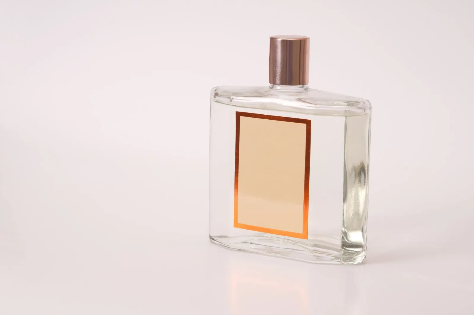
Cardboard and glass dominate successful Irish food packaging because they're genuinely sustainable, cost-effective at scale, and signal quality to consumers. Premium Irish brands often choose glass for spirits, jams, and specialty sauces because it communicates craft, protects product integrity, and justifies higher price points.
Sustainability isn't just ethical—it's commercial. Brands that clearly communicate sustainable material choices earn customer loyalty and justify premium pricing. Your package's material is part of your brand story.
Production Considerations
Material choice affects lead times, minimum order quantities (MOQs), and storage. Cardboard allows faster turnarounds and lower MOQs than glass. If you're scaling or testing new SKUs, cardboard offers flexibility. Glass requires longer lead times and higher upfront investment but delivers superior shelf impact and product protection for shelf-stable, high-value items.
Material Selection Drives Margins and Brand Perception
- 60% of Irish consumers prefer sustainable packaging—this is now table stakes
- Glass signals premium positioning but requires higher investment and longer lead times
- Cardboard offers cost efficiency and speed; dominates artisan Irish food packaging
- Material choice is part of your brand narrative, not just logistics
Label Design and Legal Compliance in Ireland
Your packaging design for Irish food brands must comply with EU food labeling regulations, which Ireland follows. Non-compliance costs money—fines, recalls, or forced repackaging. Many businesses overlook this because compliance doesn't look like design. It is design.
Required Information on Irish Food Labels
EU Regulation 1169/2011 mandates specific information on every food package. This isn't optional:
- Product name and description
- Net quantity (weight or volume)
- Ingredient list in descending order by weight
- Allergen declarations (bold or highlighted, very clear)
- Nutrition facts (per 100g and per serving)
- Storage instructions and shelf-life/use-by date
- Manufacturer or distributor name and address
- Country of origin (if not obvious)
- Any special handling instructions (e.g., 'keep refrigerated')
This information must be in English (for Ireland). Font size minimums apply—you cannot hide allergen warnings in tiny print. Many small brands get this wrong and face retail rejection or customer complaints.
Design Tips for Compliance Without Sacrificing Aesthetics
Good label design integrates required information as part of the visual story, not as an afterthought. Place mandatory info on less-premium real estate (back panel, bottom, side). Use consistent typography. Make allergens visually distinct—many brands use a box or color highlight. A designer experienced with EU food packaging will know these rules and design accordingly.
Working with a professional graphic design service that understands Irish and EU regulations saves you time and avoids costly mistakes. They'll ensure your label design for Ireland passes retailer compliance checks without compromising your brand vision.
Compliance Protects Your Brand
- EU Regulation 1169/2011 is legally binding—non-compliance triggers retail rejection or fines
- Allergen declarations must be visually prominent and clear
- Professional design that accounts for compliance saves money and avoids delays
- Back panel is prime real estate for required information that doesn't affect shelf perception
10 Common Packaging Design Mistakes to Avoid
These are mistakes we see repeatedly in Irish food brands—costly errors that could have been caught in the design phase.
- Too Many Colors or Fonts: Cluttered packaging confuses the eye. Stick to 2–3 primary colors and 2 typefaces maximum. Simplicity reads as premium.
- Illegible Text Due to Poor Contrast: Dark text on dark background or light on light fails accessibility tests and loses sales. Test contrast ratios before production.
- Unclear Product Category: Shoppers should instantly know what you're selling. If they have to think, they move on.
- Ignored Competitive Set: If your package looks identical to five competitors on the same shelf, you'll lose. Study shelf placement and differentiate on color, shape, or visual element.
- Oversized or Undersized Branding: Some brands bury their name in tiny text. Others blow it up so large there's no room for product benefits. Balance visibility with hierarchy.
- Missing Sustainability Statement: If your product is sustainable, say it clearly. Vague eco-speak doesn't work; specific claims (e.g., '100% recyclable cardboard') do.
- Low-Quality Photography or Illustration: Food photography especially matters. Blurry, poorly lit product photos on packaging make the product look low-quality, regardless of actual quality.
- Ignoring Shelf Context: Design your package as it will appear on shelf, not in isolation. How does it look surrounded by competitors? A design that looks great alone might disappear in context.
- Too Much Information on Front Panel: Front panels are for brand identity and key benefit only. Ingredient details, nutrition, and compliance belong on back/side. Every element on front must earn its space.
- Neglecting Printing Limitations: Some beautiful design concepts don't print well. Thin lines disappear, small text blurs, and certain color combinations look muddy. Work with a printer early to understand limitations.
The best packaging design for Irish food brands solves a business problem (shelf presence, price justification, category clarity). If your design is pretty but doesn't move product, it's failing.
Irish Food Brands Getting Packaging Right
Design is not just what it looks like and feels like. Design is how it works. — Steve Jobs
Looking at real examples helps clarify what works. Several Irish food brands have executed packaging design masterfully, and their success isn't accidental.
Case Study Themes from Successful Irish Brands
Premium heritage brands (think traditional Irish spirits or artisan chocolate) often use gold/warm tones, minimal typography, and glass or heavyweight cardboard. They're not competing on lowest price—they're competing on quality and story. Their packaging reflects that positioning.
Organic and health-focused brands lean into green, natural imagery, and clear sustainability statements. They use clean, modern sans-serif typography and often include visible product photos or raw ingredient visuals. Their packaging design for Irish food brands emphasizes transparency and health positioning.
Direct-to-consumer (DTC) brands often take design risks because they control the shelf story. They use bolder colors, playful typography, and storytelling on back panels because they're building direct relationship with customers, not competing for supermarket shelf placement.
What unites them: clear brand positioning, visual consistency, and design that solves a business problem (higher price point, category clarity, emotional connection). They're not generic. They don't try to appeal to everyone. And they invest in design because they know it drives ROI.
If you're uncertain how your product positions in the market, start there. Is it premium? Health-focused? Heritage-driven? Value? Your positioning determines your packaging design strategy, not the other way around.
Your Packaging Design Process: A Practical Checklist
A disciplined design process reduces errors, accelerates timelines, and ensures your packaging design for Irish food brands actually achieves business goals. Here's the framework we use with clients.
The Discovery and Strategy Phase
- Define Brand Positioning: Premium? Value? Health-focused? Heritage? Write a one-sentence positioning statement. Everything else flows from this.
- Competitive Shelf Audit: Visit 3–5 retailers. Photograph your category shelf. Study color positions, typography, messaging. Where is your white space?
- Customer Research: Ask 10–20 target customers why they buy in your category. What stops them? What persuades them? This informs design direction.
- Regulatory Review: Work with a designer or compliance specialist to confirm all required label information and format. Don't guess.
- Material and Cost Parameters: Define budget, minimum order quantity, lead time, and material preferences. This constrains design in practical ways.
The Design Phase
- Create 2–3 Design Directions: Not infinite options—2 to 3 distinct visual approaches reflecting your positioning. This focuses feedback.
- Test in Context: Print mockups and photograph them on actual shelf sections or in retail environments. How do they look surrounded by competitors?
- Gather Structured Feedback: Show concepts to 10–15 target customers. Ask specific questions: 'What do you think this product is?' 'Why would you pick this?' Not 'Do you like it?'
- Refine the Winning Direction: Iterate on color, typography, messaging based on feedback. Make 1–2 rounds of refinement.
- Produce Design Files: Work with your designer to generate all required files (print-ready files for each printing method, digital versions for marketing).
The Production Phase
- Get Printer Samples: Before full production, print sample units on your actual material. Colors on screen differ from print. Verify quality.
- Confirm Compliance One Final Time: Have a compliance specialist or your printer confirm label accuracy before production run.
- Execute Production and Quality Check: Random sampling during production catches printing errors early. Don't wait until delivery.
This process typically takes 8–12 weeks from concept to shelf-ready product. Rushing it introduces errors and costly reprints. Investing in good professional graphic design at the outset saves time and money downstream.
Process Beats Talent in Packaging Design
- Disciplined discovery phase prevents costly design pivots later
- Testing concepts in actual retail context reveals shelf performance before production
- 2–3 design directions force strategic thinking; unlimited options lead to indecision
- Sample printing and compliance verification prevent expensive reprints
Packaging design for Irish food brands is a strategic business tool, not a design afterthought. A well-executed package stops shoppers, communicates value, and justifies premium pricing. It builds brand recognition, enables retail placement, and drives repeat purchase. The reverse is also true: weak packaging leaves money on the shelf.
Your competitive advantage isn't just what's inside the package—it's how you tell that story on the shelf. Invest in understanding your market position, your target customer, your retail environment, and your regulatory landscape. Then invest in design that serves those insights. The cost of professional packaging design for Irish food brands—€2,000 to €7,000 upfront—pays for itself through higher shelf velocity and customer perception within months.
Whether you're launching a new product or repositioning an existing brand, start with strategy, validate with customers, and refine in context. Don't just make something that looks good. Make something that sells. If you need expert guidance on packaging design or want to explore how strong brand positioning across all touchpoints drives growth, ithouse.tech offers comprehensive graphic design services and digital marketing strategy tailored to Irish food brands. We've helped hundreds of brands build visual systems that win on shelf and build lasting customer loyalty.